PROBLEM STATEMENT
Design an AI based matrimonial platform that helps in connecting people through their unique compatibility algorithm. Their aim is to make that process as easy and stress-free as possible.
Role
UX designer / researcher
Time
5 months
Team
Solo
Industry
Consumer and personal services
Quick summary
HIGHLIGHTS
-
Vision is to bring excitement & courtship to the process of online matchmaking.
-
Mission is to provide customers with the opportunity to connect with compatible life partners quickly.
-
Key challenges faced were lack of trust in online matrimony, user engagement and matchmaking, competition and market saturation.
SOLUTION
-
By leveraging a user-centered design approach and iteratively refining the app based on feedback, I successfully improved its overall usability and functionality.
-
Gave it a fresh look and led it to have more user testing to land in the app store.
RESULT
-
Led usability testing, gathering feedback from 25+ B2C customers, refining product design, and improving onboarding completion rate from 57% to 90.38%.
-
Secured buy-in from key stakeholders with a 90% approval rate.
Before I move ahead...
Some assumptions, challenges, constraints and thoughts.
-
The primary assumption is user's trust in the AI's ability to identify "unique compatibility" for marriage and their willingness to share deep personal data, despite significant challenges like building AI transparency, avoiding algorithmic bias, and ensuring robust data privacy.
-
A major challenge is overcoming widespread user distrust due to fake profiles and misrepresentation, while also preventing engagement fatigue from unresponsive profiles and endless swiping.
-
A key constraint and challenge is balancing the promise of an "easy and stress-free" experience with the need to collect sufficient, high-quality personal data essential for the AI's complex compatibility algorithm.
-
Constraints include the current maturity of AI for subjective human compatibility and the critical need for ethical design to ensure fairness, prevent bias, and comply with data regulations.
-
Some UX design had already been done. So how to best utilise this.
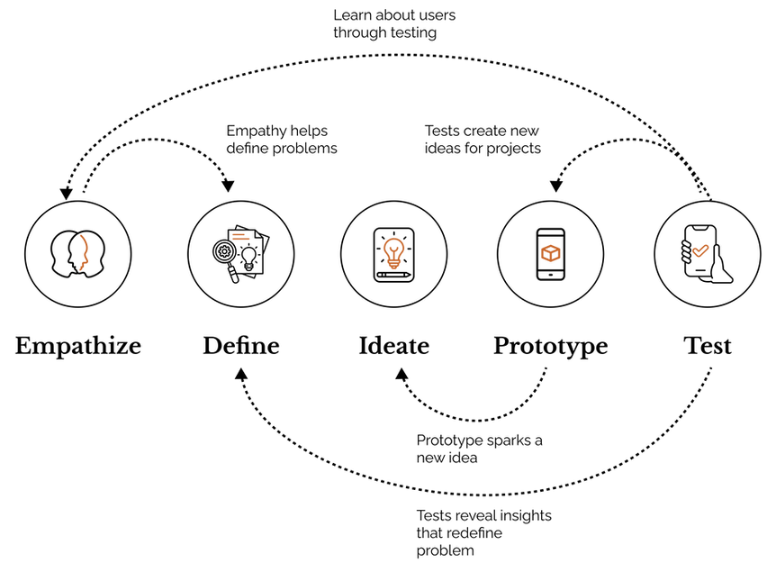
The process
In order to create a user-centric solution, we employed the User Centered Design process, which involved conducting thorough research, engaging in iterative design and testing, and continuously incorporating user feedback to refine and improve the product.
DISCOVERY
User story

Competitive benchmarking


To identify strengths and gaps in the current market, we conducted a competitive analysis. This included comparing apps like Shaadi.com, Jeevansathi, BetterHalf, and Aisle, considering both direct and indirect competitors.
DEFINE
User interviews
Qualitative interviews are one of the most effective ways to understand and empathize with consumers. Our objective was to gain deeper insights into the thoughts, emotions, and challenges of potential users. The data collected helped us develop more accurate user personas, journey maps, and key product elements like features and workflows.
Our Approach
-
Methodology used for conducting interviews: Remote
-
Recruitment Process: We selected our participants on the basis of a few screening criteria such as:
-
People who have used/ are using matrimony app.
-
Equal number of male and female participants.
-
Is between the age group 25-36 years old.
-
-
We conducted 8 interviews. Each session lasted from 15 mins to 45 mins, depending on different participants.

We opted for a semi structured interview. We took a participant centric approach. The questions were open ended and consisted of a lot of follow up questions.
Few of the questions we asked,
-
How long have you been using the matrimonial site?
-
Is there any part of this experience that you enjoyed or looked forward to?
-
If you had a magic wand, what part would you change in your life related to this?
Thematic analysis
We performed thematic analysis for identifying themes within qualitative data. Some of the themes we found are
Privacy concerns
Ghost accounts
Technological pitfalls
Unwanted profiles
Recommendation Engine
Are you even Real?
User Interview Findings
People look different on their profile picture and real life.
“I wasted my time with one person for 2 months. I met them and realized that his age is not what he mentioned. He was very straight forward about it. But I felt deceived.”
- A person who got catfished
Users want privacy and control over their data and avoid unwanted calls and online stalking.
“I don’t prefer giving my number to just anyone. So that was the worst. I didn’t want a person googling my name and finding out where I work for more details about me. I was bought up in a very sheltered home”
- A woman who is new to online matchmaking
Delayed responses and inactive profiles confuse and frustrate users about match availability.
“Number one reason of irritation for me is the unresponsiveness of folks in the matrimonial apps.”
- A person who just switched from dating apps
Empathy mapping
To gain deeper insights into users' needs, emotions, and motivations, we developed an empathy map. This approach helped us uncover not only their pain points but also their potential actions, feelings, and the underlying causes of their frustrations with existing platforms. For instance:
What user said:
“ I think what I don’t like the most is the wait after sending the request. Sometimes you don’t get reply for days and some times never.”
What this user thought:
“Does he/she/they not like me?” Or “Are they ignoring me?” Or is this profile even active? Was my message sent?”
What this user does:
Wait for the reply for days. Keeps checking their notifications or opening the application.
How they feel:
Vulnerable, unsure, frustrated.

This led us to recognize the importance of timely communication and profile activity. To address these needs, we introduced features such as request expiry times and profile status indicators to boost user engagement. Furthermore, we prioritized active profiles in search results to enhance the overall user experience
Journey mapping
Having identified numerous user pain points, journey mapping allowed us to visualize the interaction stages where opportunities and areas for improvement existed

Information architecture
We updated the site map by adding screens to represent the newly required features. A user flow was then created, highlighting potential roadblocks and key decision-making moments in the user's journey.
Sitemap

User flow

Usability study
We had identified several issues faced by our users. Journey mapping helped us visualize the stages of interaction where opportunities and areas for improvement existed.

Type of user testing: Qualitative user testing, remote.
No. of participants: 7 (5 real + 2 test participants)
Metric used: Google’s HEART framework. (Happiness, Engagement, Adoption, Retention and Task efficiency.)
Goal: The tasks were designed to determine whether the IA was effective for users and if the grouped information was logical and intuitive for them.
Brainstorming workshop
We organized a collaborative Crazy 8 workshop with stakeholders and team members. This dynamic session encouraged everyone to share ideas and perspectives to address our design challenges. The workshop fostered creativity, produced practical and engaging solutions, and enabled us to make substantial progress in a short period

IDEATE
First iteration samples
The design process began with creating initial sketches and low-fidelity wireframes. These wireframes were iteratively refined and underwent detailed stakeholder reviews to ensure effective organization and presentation of information.


THE UI
Final iteration samples
Changes were made according to feedback received from stakeholders and usability study. We successfully completed the development of high-fidelity wireframes, marking a key milestone in our design process. These wireframes are now being prepared for the next round of usability testing and UX benchmarking, enabling us to gather valuable insights and further refine the designs for an optimal user experience.


Prototype


VISUAL LANGUAGE
Typography
Type scale

Colours
The combination of the trustworthy primary blue with the harmonious secondary blue establishes a foundational sense of security and modern compatibility. This reliable base is then accented by the warm and passionate coral, which highlights the emotional and celebratory aspects of finding love, collectively conveying a journey from reliable beginnings to joyful connections.

Review and reflections
This UX case study of an online matchmaking application highlights my journey in designing a user-centered experience from the ground up. Through usability testing and user interviews, I gained valuable insights into user needs, preferences, and pain points.
A significant takeaway from this project was the importance of prioritizing user experience, even when working under the constraints of launching an MVP. While tight timelines may encourage compromises, maintaining a focus on UX is essential for ensuring user satisfaction and engagement.
By leveraging a user-centered design approach and iteratively refining the app based on feedback, I successfully improved its overall usability and functionality.
This startup project offered invaluable experience in managing the UX design process, collaborating with stakeholders, and addressing the challenges of building a product from scratch. It underscored the importance of user research, empathy, and continuous iteration in creating meaningful and impactful user experiences.