PROBLEM STATEMENT
Healthy Innovations Platform (HIP) is a health management system that helps patients better understand and manage health conditions. It is also an enterprise platform for Case Management (Predictive and Complex Case Management)
1. Find opportunity areas to improve in HIP workflow from user feedback.
2. To revamp current User experience and transition to Carelon UI guidelines.
3. Improve member dashboard by helping member customise what they would like to see.
Role
UX Design
Time
3 months
Team
4 Designers
Industry
Healthcare
Quick summary
HIGHLIGHTS
The project involved a large team with several stakeholders, including VPs and subject matter experts. Many of the modules were standalone products before.
-
We had to navigate a platform filled with vast amounts of data and outdated research.
-
The project lacked a clear timeline and scope.
-
New branding guidelines had been introduced, but no clinical usability checks had been performed. But in the end we had to strictly utilize company approved design library.
SOLUTION
-
Side panel introduced with customization options to optimize space and easy identification. Suggested action directs the user to their next task with a tool tip explanation.
-
Introduced a dashboard filter and preview section to let the user select their required fields and rearrange data as per their need. You can even save configurations for future use.
RESULT
-
Reduced avg task completion time (time on task) by 33% through data-driven design decisions.
-
Reduced the CSR agent calls by 8%.

All components and elements in the visuals are Carelon approved and owned and cannot be changed.
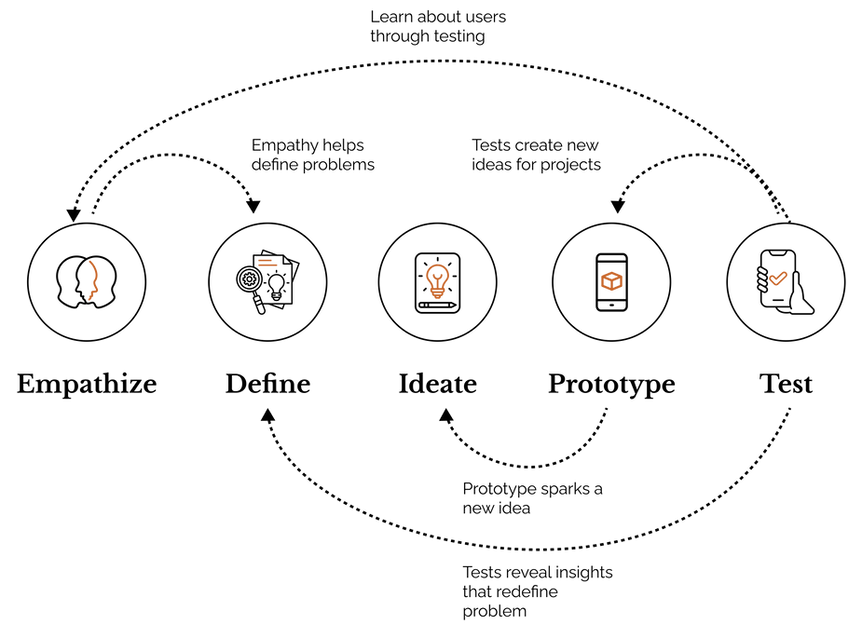
The process
In order to create a user-centric solution, we employed the User Centered Design process, which involved conducting thorough research, engaging in iterative design and testing, and continuously incorporating user feedback to refine and improve the product.
Before I move ahead...
Some assumptions, challenges, constraints and thoughts.
1. We only had SIT access and not production access. This is a desktop only platform.
2. The initial meetings signaled a revamp, but it kept moving between priority features, low impact areas and back to revamp.
3. Understanding the extensive amount of information by itself and from the perspective of everyone involved (designers, managers, users, leads, developers, SMEs) took time, but business expected a quick turnaround time.
4. Lacked avenues for feedback and validation from the users, especially the clinicians.
5. There were many key players for the project and who takes major decisions was unclear. Everybody looked at each other for validation.
Team structure

Timeline
Due to a tight timeline, we were tasked with delivering solutions before fully understanding the domain. To address this, we defined an immediate scope and created a timeline ourselves.
As we gained deeper domain knowledge through user interviews and stakeholder discussions, the team became better prepared to tackle complex challenges and recommend structural workflow changes to the platform. In the meantime, we focused on addressing heuristics and known issues, developing solutions for immediate problems through two-week sprints.

BACKGROUND RESEARCH
Understanding HIP
The Platform
The care management platform serves as a unified interface where trained nurses act as case managers, engaging with members (insurance payers) to address and resolve their health issues and barriers.
Interactions are initiated either by the user calling the member or vice versa. Each issue follows its own workflow, with the sequence of actions determined by the phone interaction. The process appeared highly dynamic, with data privacy and process compliance further influencing the processing time.


Understanding the domain and workflows
We began with desk research to gather information on care management, competitors, and past interview files.
To validate our insights, we consulted system analysts with technical expertise, who also shared survey data from platforms like Medallia. This helped us identify key opportunity areas.
Next, we need to ensure that user opportunities align with our findings.

PROBLEM IDENTIFICATION
Why?..How?
Instead of simply accepting business ideas and technical requirements, we presented our questions and doubts supported by initial research to the business team. This approach established the importance of involving users before undertaking a revamp.


To engage with users, SMEs, and researchers, exploratory interview sessions were conducted, and the recordings were shared with our team.
The next step involved deriving insights and identifying key opportunity areas to focus on.
Interview for clarity
*Images blurred/unclear to hide data


SYNTHESIS
Identifying the theme
Apart from technical limitations pointed out by users, 3 major themes emerged from insights
Personalization
Users want the system to adapt to their specific use cases and minimize manual effort.
Effective Communication
Users expect the product team to clearly communicate all features and explain how they can enhance their workflows.
Minimalism
The platform's data-intensive nature is causing excessive cognitive load. Users prefer to concentrate on tasks without any distractions.
Using research insights, the team began ideating features based on emerging themes that were mutually agreed upon by the business, development team, and SMEs, considering user needs and feasibility.
Feature prioritization
-
Allow users to filter and customize their workbench to suit their specific use cases.
-
Enable users to select the necessary member details to minimize cognitive load.
-
Simplify navigation to user tasks for greater efficiency.
-
Introduce dictation functionality for long forms.
-
From the ideations presented to SMEs and the business team, two key ideas emerged:
-
Allow users to create a personalized workspace using a split-screen approach, enabling them to work on two selected tasks side by side.
-
Since users were already using split tabs in their browsers to reference information while working on tasks, this behavior could be leveraged into a design solution.
-
A proposed layout was created and shared with users for feedback.
Paper sketch

IDEATION
Initial iteration sample
With the direction finalized, the initial iterations were presented to users.
We observed that users prefer to focus on one task at a time but frequently reference information while taking notes.
Additionally, we identified opportunities to link the Member Overview (on the right) to various workflows on the page, connecting it to all the tasks users need to complete.
THE UI
Revised/final iteration sample
The existing technology couldn't automate or customize tasks for the user, so we provided a way for users to customize it themselves for specific tasks.
Important note:
We had to keep in mind that the company approved design library had to be followed because drastic changes to the visual design will make it very difficult for users to get used to it since this application is almost 10 years old.
Action list (landing page)
Streamlined Visuals & Navigation
-
We've improved space use, refined visuals, and simplified filters to create a cleaner, more intuitive interface.
-
The design also incorporates a distinct, high-contrast side panel to reduce horizontal scrolling fatigue.
Clear Orientation & Accessibility
-
The current page is emphasized with a large font header, ensuring users always know where they are.
-
This improved interface is easily accessible from the top right menu in the workspace.

Customization overlay
Guided Configuration Setup
-
We've adopted a step-by-step approach to configuration, effectively splitting operations into two distinct phases to reduce cognitive load.
-
This ensures users are guided through the process, making complex setups more manageable.
Real-time Customization & Refinement
-
Step 1: Dashboard Filter and Preview allows users to select and rearrange fields while seeing real-time previews of their data.
-
Step 2: Configure Filter then lets users refine their view using advanced filtering options.

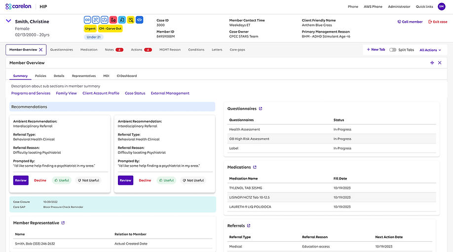
Member overview page
Streamlined Navigation Hub
-
Centralized navigation elements and grouped sections within the side panel allow users to quickly find what they need.
-
This new navigation design lets users switch sections with a single click, reducing errors and eye fatigue.
Intuitive Feedback & Direction
-
Suggested actions with tooltip explanations gently guide users to their next task.
-
Greyed-out expanded sections provide clear visual feedback, indicating the current page within its broader context.
.png)
Split screen view
Streamlined Task Management
-
The design simplifies interactions by focusing on one main and one accompanying task, eliminating complex switching, while still supporting expert users.
Enhanced Navigation & Clarity
-
Users can clearly identify open pages and easily manage them from the side panel, contributing to a less complex experience.

Questionnaire page
Streamlined Questionnaire Design
-
Implemented a compact questionnaire view with consistent accordion interactions to enhance clarity and reduce user confusion.
Enhanced User Interaction & Utility
-
Provided the ability to add tagged notes directly to the questionnaire, improving user utility and information management.
.png)
Care plan page
Design & User Experience Consistency
-
Achieved consistent cross-platform design and enhanced information hierarchy to prioritize user needs, reducing errors.
Interaction & Information Management
-
Utilized task decomposition for micro-interactions and implemented progressive disclosure to manage complex user flows and group information effectively.
.png)
Medications page
Ease of access
-
All medications can be previewed in a click.
-
Users can edit and add medication all in one page without any split screen/ pop up.
Aiding search
-
Adding fill date helps users identify when medications were filled previously.
.png)
ANNOTATION
Delivering design for the sprint
A quick turnaround time of 1 week was expected for these screens to show it to leadership. The design system approved by the company had to be maintained.
The designs were approved and sent with annotations.


VISUAL LANGUAGE
Brand values
The brand values help identify the colours, font and associate how the users relate to our brand psychologically
We want to be this...
Warm, friendly
Aspirational
Simple, modern
Innovative
Solution-oriented, empowering
...without becoming this
Casual, cute
Grandiose
Minimalist, cold
Aggresively disruptive
Salesy, condescending
Typography
Elevance Sans is a highly flexible and functional component to the company's logo. It's a custom proprietary font created just for the brand. It is precise, yet human, functional, yet expressive.
Colours
The primary colours are Purple and White. These colours are supported by several secondary colours. Altogether, the colour palette provides us with a future-forward, yet warm tonality that helps stand out.

Primary

Secondary and accent

Neutral
Button

Icons

Review and reflections
The newly introduced changes designed to support user workflows were well-received during the initial usability review and have been planned for future releases.
However, the current case manager workflows remain heavily affected by technical limitations. Due to the complexities and compliance requirements, any proposed changes to the product are often met with skepticism.
Following the success of our initial design interventions, the team gained confidence in addressing user needs and was able to explore the case manager workflows more deeply.