PROBLEM STATEMENT
Design a chatbot to engage with users in natural language conversations to gather relevant health information, offer medical advice, and guide users to appropriate healthcare resources.
Role
UX Design
Time
2 weeks
Team
Solo
Industry
Healthcare
Quick summary
HIGHLIGHTS
-
This chatbot is designed to engage with users in natural language conversations to gather relevant health information, offer medical advice, and guide users to appropriate healthcare resources.
-
The chatbot utilizes artificial intelligence and machine learning technologies to understand user queries and provide relevant responses.
SOLUTION
-
I adhered to a user-centered design approach throughout the process, resulting in a chatbot that is intuitive, clean, simple, and delivers quick, effective search results by continuously learning and adapting to users' needs.
-
Most importantly, the final product enhances Carelon's ability to save time for both users and customer service agents while boosting user satisfaction.
RESULT
-
This POC was converted to a full time product utilized by the employees at Carelon.
-
Increased customer retention by 15%. Reduced CSR agent calls by 21%.
Before I move ahead...
Some assumptions, challenges, constraints and thoughts.
1. This is a proof of concept(POC).
2. A feature is being introduced in the existing application Sydney which is repository of huge amounts of information. Currently the app is facing issues with customer retention as well as an increase in calls to CSR agents.
3. This POC has to be delivered in 10 business days.
Timeline
The timeline encompassed research, ideation, design, development, and continuous improvement, ensuring a user-centered approach to deliver a seamless, efficient, and adaptive conversational experience.

DISCOVERY
Secondary research
Through my secondary research, I realised that:
-
User expect AI chatbots to understand natural language, perform tasks, and engage in human-like conversations.
-
User expect quick responses on information and support for medical inquiries.
-
User trust is paramount, as users are concerned about the accuracy and privacy of healthcare-related information.
-
Users value chatbots that can assess symptoms and provide preliminary advice and clear disclaimers.
-
Adherence to healthcare regulations, such as HIPAA is crucial.
-
The chatbot should play a role in educating users about health topics, preventive care, and healthy lifestyle choices.
-
Understanding the demographics of the target audience is essential for tailoring the chatbot's responses and features effectively.
-
The chatbot should communicate in a friendly and empathetic tone while using plain language to ensure accessibility to a wide range of users.
-
Consider partnerships with healthcare providers or institutions to enhance the chatbot's credibility and access to medical expertise.
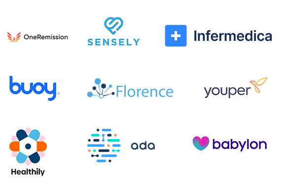
Competitive benchmarking
After the secondary research, I conducted a digital survey with our user group to learn more about how they feel about using the existing application and resources. I organised the necessary resources, got in contact with the user group and got 100 pieces of valuable feedback.
DEFINE
Problem area identification
With all the notes, documents and data from the digital survey, I put everything in perspective, synthesized with the participants, and created the major problems areas, personas, user experience maps, and scenarios.
Identifying the problem areas
Thorough analysis of the digital survey led to identifying the major problem areas

I couldn't find an answer to my question. Build your website from a consumers view, someone who doesn't deal with healthcare every day.
- Anonymous User 1
Friendly little chat is not very helpful nor fast. no help at all with anything that's out of the norm... which it seems most of my things are. Had to resort to actually calling and got stuck in that long winded verbal barrage before I could talk to a real person. ARRGGH!
- Anonymous User 2
The bot chat doesn’t have how to dispute a claim. Can’t get to a live agent after many tries. Happy to use the bot when needed but don’t want to get stuck in bot circle of question like an ivr.
- Anonymous User 3
User persona
After a deeper look into the digital survey and problem areas, I created four personas,
Emily
Wants to access information related to her health problems and is open to scheduling a virtual consultation with a healthcare professional.

Maria
Wants to locate a provider specialist who can provide a thorough evaluation of her digestive issues. She also wants to use the chatbot to help her schedule an appointment with the chosen specialist at a time that fits her busy teaching schedule.

John
Wants to gain a clear understanding of the terms, coverage, and benefits offered by his health insurance policy. And he also is seeking guidance on how to navigate the process of filing claims and seeking reimbursement for medical expenses covered by his insurance.

Alex
He aims to deliver efficient and empathetic customer support to users. Alex takes pride in being a reliable problem solver, finding creative solutions to users' queries and ensuring that their needs are met.

User experience map
The ideal flow was divided into 3 stages:
-
Pre-onboarding
-
During interaction
-
Post experience
The user thoughts and feelings in each action stage was identified to come up with areas of opportunities.
Based on these opportunities a list was prepared of features and UX recommendations.

UX recommendations and features
UX recommendation
Giving a persona to the chatbot for a more human like interaction.
-
Recommendation chips on the screen just below the header based on the text they input. (policy, claims and texts related to it)
-
Recommendation chips relevant to the search result.
-
Autocomplete suggestion in text that gives suggestions when typing a query.
-
Display a disclaimer message that tells the user that the chat/call is being recorded.
UX recommendation
-
After every interaction with the person- ask the user if the chatbot was able to solve their issue or if they need another resolution. Or talk to an agent.
-
If its is a multiple question based query then the chatbot should clearly give progress indicator or answer both questions in a systematic manner like a conversation. firstly, secondly.
Features
-
Give a feature to edit a previous message sent to the bot and provide a disclaimer that says-” the conversation henceforth would start anew!”
-
Additionally the bot should not forget the context of the conversation.
UX recommendation
-
Make the visual overview interactive, allowing users to click or tap on each coverage category to reveal more detailed information.
-
Provide a seamless transition from the visual overview to the detailed breakdown.
-
Incorporate colour coding to differentiate between different types of coverage.
-
Use icons or symbols to represent specific coverage features, such as doctor visit, prescriptions, or hospital stays.
UX recommendation
-
Using simple language and providing a concise and easy to understand explanation.
-
Present a step by step breakdown of the claims process using interactive checklist that lets the user mark what they have finished. display each step in a sequential order to guide the user through the process.
Features
-
Use infographics or diagrams to illustrate the claims process flow, making it visually engaging.
-
Offer an interactive tutorial that simulate the process, allowing users to practice filing a mock claim.
-
Clearly outline the types of documents and provide examples of acceptable formats.
-
Integrate a user friendly document upload feature that allows user to attach necessary files directly within the chatbot interface.
-
Implement a progress tracker that shows the current stage of their claim submission.
Features
-
Include advanced search filters for users to narrow down provider options based on location, speciality, rating and more.
-
Geolocation services
-
Display providers on an interactive map, allowing users to visually explore nearby options and their proximity.
-
Implement search autocomplete to help users find providers quickly and easily.
-
Incorporate user generated ratings and reviews to help users make informed decisions about selecting a provider.
-
Direct booking integration
-
Highlight providers who offer telehealth or virtual appointment options, especially relevant in today’s healthcare landscape.
-
Save and compare feature- allow users to save favourite providers or create a shortlist for easy comparison.
Features
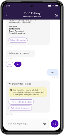
Display a clear and easily accessible button labeled "Helpline" or "Customer Service" within the chatbot interface.
Contextual Responses:
-
Provide an automatic response with the helpline number when the user inquires about customer service or helpline assistance.
-
Enable a "One-Click Dial" feature that allows users to initiate a call to the helpline directly from the chatbot interface.
-
Offer the option to copy the helpline number to the user's clipboard for easy dialing
-
Indicate the current availability status of the helpline (open/closed) based on the user's local time.
-
Provide information about the helpline's operating hours and availability on different days of the week.
-
List other available contact methods such as email, live chat, or social media for users who prefer non-phone communication.
-
If applicable, inform users about estimated wait times for connecting with a customer service representative.
-
Include links to frequently asked questions and self-help resources that may address common inquiries.
-
Display a visual confirmation message that includes the helpline number and, if possible, provide an audio confirmation.
-
If the user expresses hesitation or uncertainty about contacting customer service, provide reassuring prompts that emphasize the importance of assistance.
Integrate a feedback mechanism for users to rate their experience with the helpline assistance.
Scenario
Based on area of opportunities, features and UX recommendations, 5 scenarios were created.
John recently had surgery and received a medical bill that he thinks should have been covered by his insurance. He contacts the chatbot to inquire about the status of his claim and to understand why it wasn’t approved.
Alex, a member, recently underwent a medical procedure. He receives a bill for the procedure and is unsure whether it’s covered by his insurance. he also wants to understand the claims process and how to request reimbursement for his out-of-pocket expenses.
Emily is planning to undergo a medical procedure and wants to know if it’s covered under her insurance plan. She reaches out to the chatbot to get information about her coverage and benefits for the specific procedure.
Jessica, a member who recently moved to a new city for work. She needs to find a healthcare provider in her network for an upcoming check-up, and she also has questions about her coverage and benefits
Mark, a member has recently received his insurance ID card in mail. He wants to understand how to use the card, view his profile information, and inquire about his spending accounts.
Site map
Site mapping is always important - it gives designers a bird's eye view of the product, it shows how pages are prioritized, linked, and labeled. The team worked together to pan out the sitemap based on the user flows. Based on the persona we created, the team worked together and identified the route, the most critical tasks that deliver the most value to the users on the product.

IDEATE
First iteration samples
We reviewed everything we had created so far - persona, user flows, and sitemap before we started.
The rest of the team was highly involved, too, during this stage. We communicated efficiently throughout, it was a "wireframe > iterate > re-wireframe" type of process.
Together, we went through 3 rounds of iterations by the end of this stage before the wireframes were approved.


Revised iteration samples
Changes were made to improve on the designs, functionalities and visual


THE UI
Final visuals
Visuals were modified for POC approval. The input given was, " We need you to design our new medical AI chatbot. Make it futuristic and visually stunning – something that really stands out and impresses. It should feel cutting-edge, almost like something out of a sci-fi movie, but also be super easy for patients to use. Just make sure it looks 'next-gen' and is intuitively brilliant for everyone, from tech novices to our expert clinicians. We're looking for that 'wow' factor, so let's push the boundaries with the interface and interactions to truly capture attention and show off our innovation."
I followed our companies own Carelon Style Guide. We had to make sure that all UI elements could work with the Carelon system, aesthetically and functionally. Margins, gutters, spacing, fonts & sizes - everything needed to be in line with the components kit.

Review and reflections
Empathy-Driven Design:
This project emphasized the importance of designing user-friendly tools tailored to specific needs in the healthcare sector. The chatbot’s ability to simulate natural conversations and provide step-by-step guidance demonstrates how technology can simplify complex processes, such as filing claims or finding providers. Understanding user pain points—like scattered data and the need for personalized assistance—was essential in creating a solution that feels intuitive and approachable.
User-Focused Enhancements:
Incorporating features like progress tracking, interactive checklists, and the ability to edit messages ensures that users remain in control of their interactions. Autocomplete suggestions, recommendation chips, and contextual responses provide efficiency, while visual aids like infographics and maps improve accessibility and engagement. Color-coded overviews and easy transitions between steps further simplify navigation, ensuring users aren’t overwhelmed.
Balancing Functionality and Experience:
While implementing advanced features like geolocation, provider comparisons, and telehealth integration, it was crucial to maintain clarity and simplicity. Features like one-click dialing, direct booking, and user feedback mechanisms show how small details enhance the overall experience. The project highlights the value of iterative design—incorporating user feedback and refining features to build a system that not only meets needs but exceeds expectations.